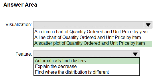
HOTSPOT -
You have a dataset named Pens that contains the following columns:
✑ Unit Price
✑ Quantity Ordered
You need to create a visualization that shows the relationship between Unit Price and Quantity Ordered. The solution must highlight orders that have a similar unit price and ordered quantity.
Which type of visualization and which feature should you use? To answer, select the appropriate options in the answer area.
NOTE: Each correct selection is worth one point.
Hot Area: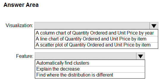

maybelline_ny
Highly Voted 4 years, 9 months agoCDL
Highly Voted 4 years, 8 months agoAnalyst_BK
4 years agoIhueghian
3 years, 10 months agoRaghav_L
Most Recent 2 years, 11 months agoDesu24
3 years agoAnh_Hogewoning
3 years agoSoniPrince
3 years agoIntellectual
3 years agoRaghav_L
2 years, 11 months agoSelaeloM
3 years, 1 month agoSiri1984
3 years, 3 months agoSingSingLI
3 years, 4 months agoAshley090521
3 years, 5 months agoAri_
3 years, 5 months agosoyc7
3 years, 7 months agoAmsterliese
3 years, 7 months agoNOBODY1230
3 years, 7 months agoimaaaa
3 years, 10 months agoIhueghian
3 years, 10 months agoHaliBrickclay
3 years, 10 months agofrancis6170
3 years, 12 months agofaridavaliyeva
3 years, 12 months agoSiri1984
3 years, 3 months ago