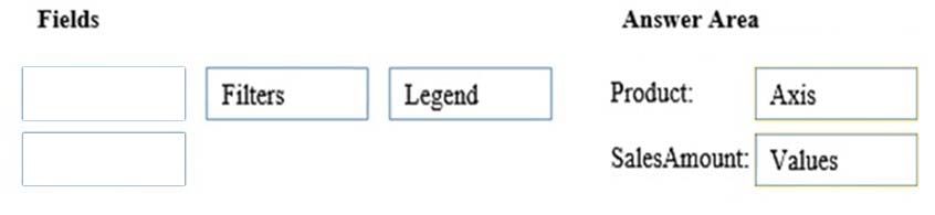
DRAG DROP -
You create the PivotChart shown in the exhibit. (Click the Exhibit button.)
Exhibit: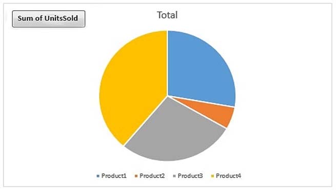
In which area is Product and in which area is SalesAmount? To answer, drag the appropriate fields to the correct areas. Each field may be used once, more than once, or not at all. You may need to drag the split bar between panes or scroll to view content.
NOTE: Each correct selection is worth one point.
Select and Place: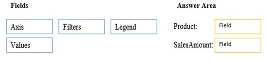

Aurelkb
Highly Voted 5 years, 8 months agoammu
5 years, 7 months agoShil
5 years, 6 months agoSN22
5 years, 4 months agohfgirona
4 years, 7 months agokwmmss
4 years, 5 months agoJohnFan
Highly Voted 5 years, 8 months agoDaviddy
5 years, 5 months agojason69
4 years, 6 months agoP_S09
Most Recent 4 years, 7 months agoosaid
4 years, 8 months agoWaltmas
4 years, 11 months agoAgustin
5 years agosumitmalik
5 years agoNastja
4 years, 5 months agoOutsider
5 years agoEric777
5 years agoCibrevN
5 years agoikenigs
4 years, 12 months ago123
5 years, 1 month agoThomasKwakman
5 years, 3 months agoJideID
5 years, 1 month agohfgirona
4 years, 7 months agozandt
5 years, 6 months agoSamewiss
5 years, 8 months ago