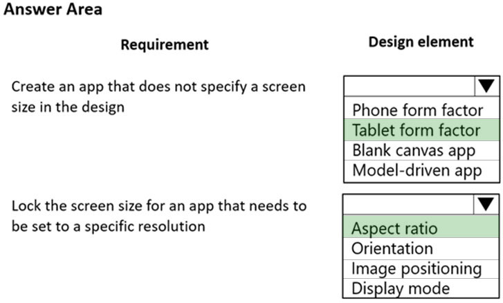
HOTSPOT -
A company is creating new app for use by technicians.
Previous versions of the app do not render properly on tablets and phones.
You need to ensure that the new app renders properly on all devices.
Which design element should you use? To answer, select the appropriate options in the answer area.
NOTE: Each correct selection is worth one point.
Hot Area: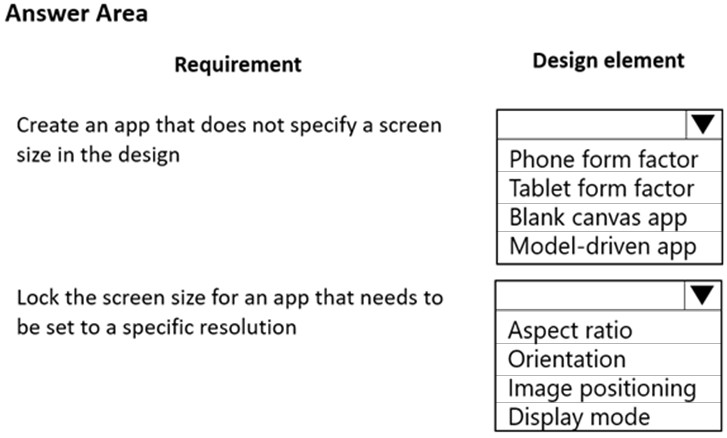

eulopez
Highly Voted 2 years, 9 months agoSHNH
Highly Voted 2 years, 6 months agoEdriska
Most Recent 1 year, 11 months agoEdriska
1 year, 11 months agocharles879987
2 years, 3 months agoSupaFresh
2 years, 3 months agoAarushiarjun154
2 years, 4 months ago[Removed]
2 years, 5 months agoDarioReymago
2 years, 6 months agoRazielLycas
2 years, 7 months agoAnitaR
2 years, 7 months agoAnitaR
2 years, 7 months agoptmk
2 years, 7 months agoAman66
2 years, 9 months agoAman66
2 years, 9 months agoRICHARDALEX007
2 years, 9 months ago